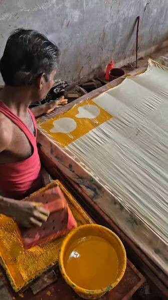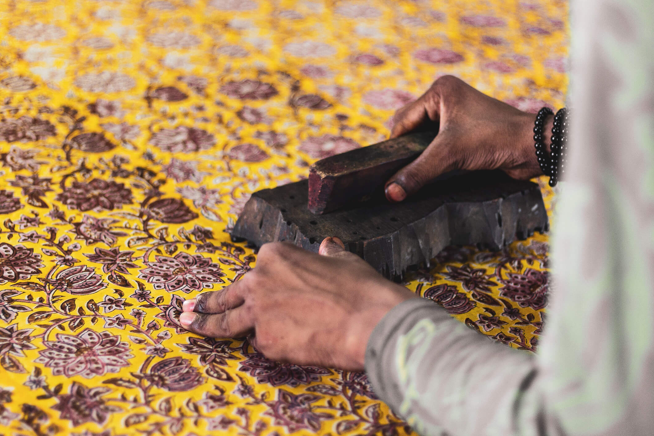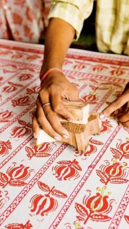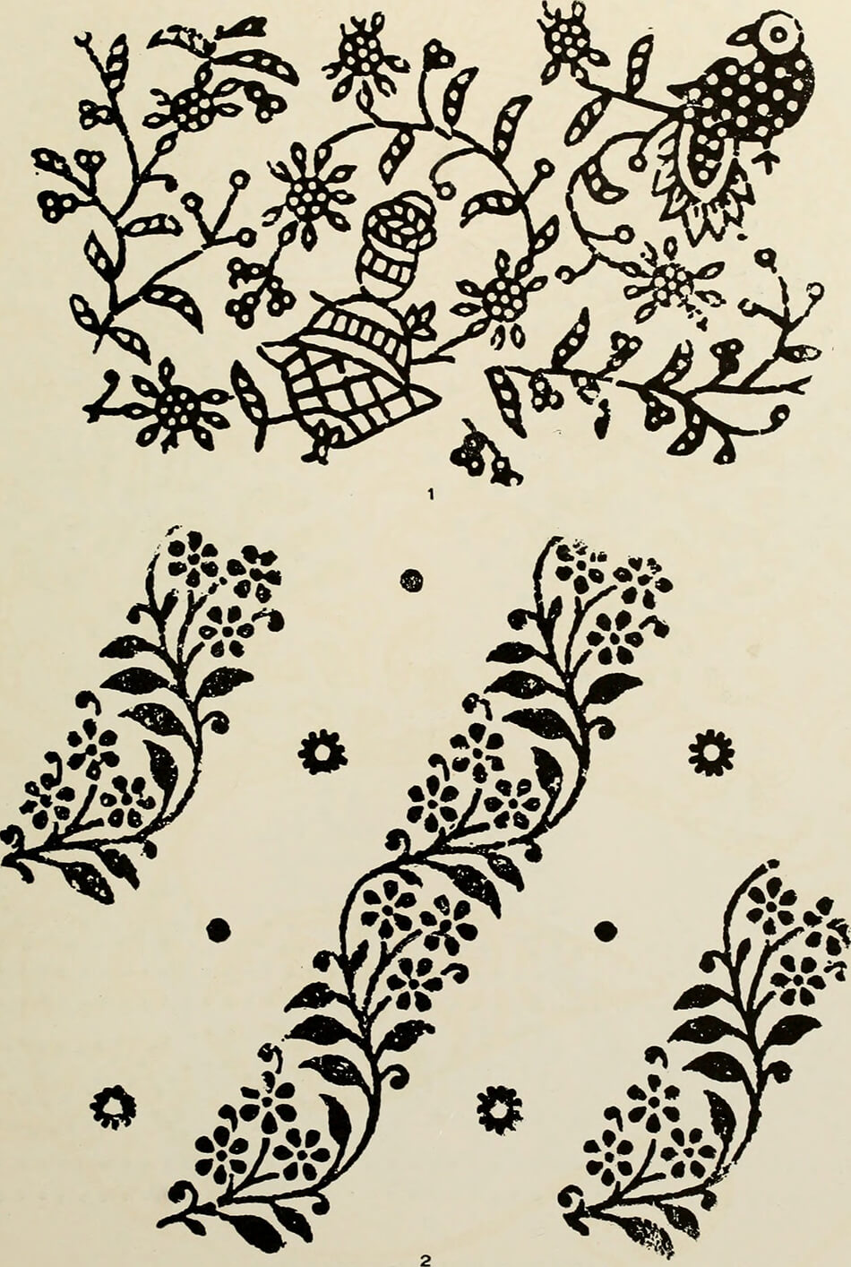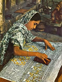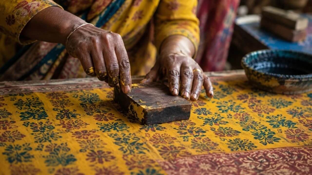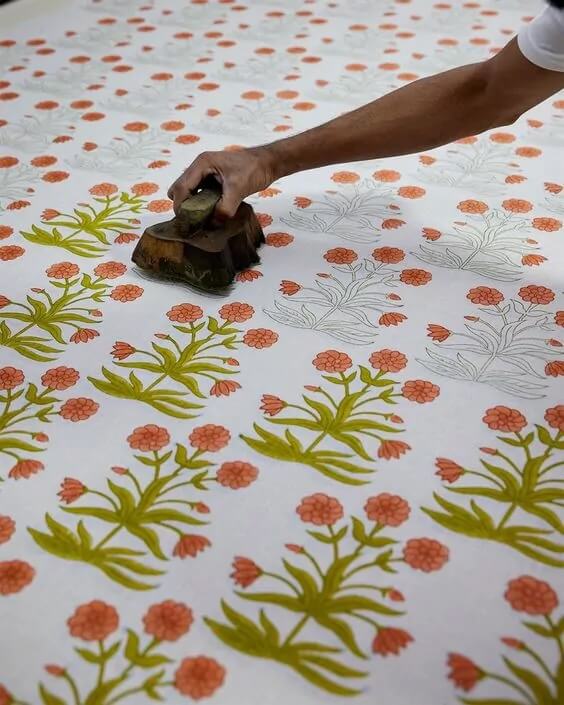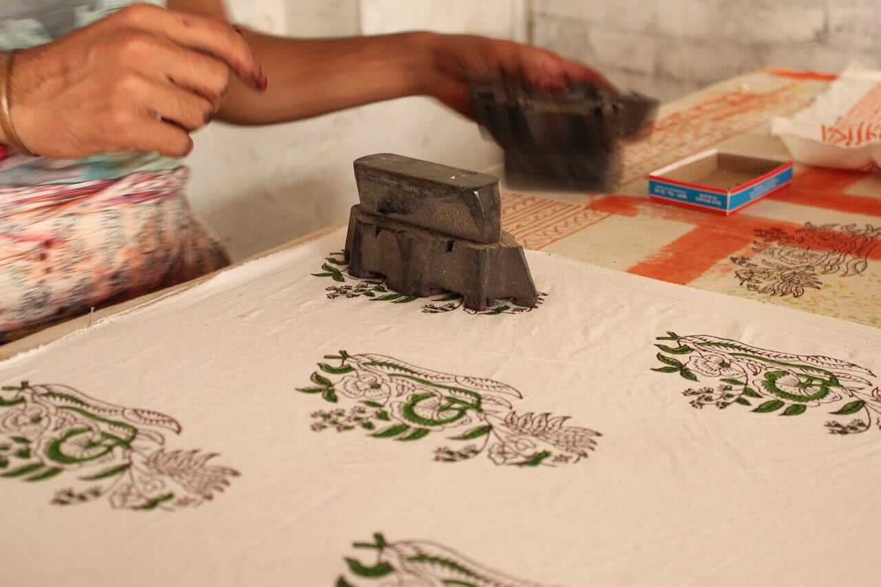


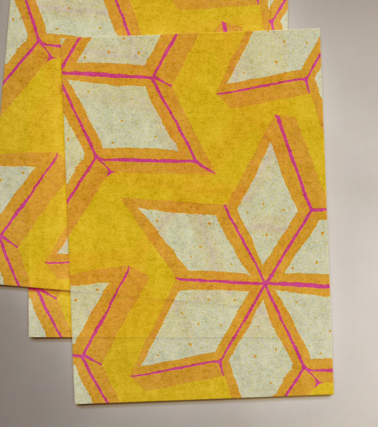


Our process began with discovery. We were inspired by Indian woodblock prints for their strong use of craft and technique. First, the rekh, derived from the word rekha, meaning outline. This block forms the fine, elaborate outline of the print, creating a detailed framework. Second, the datta, the filler block, used to stamp colours and details inside the design outlines.
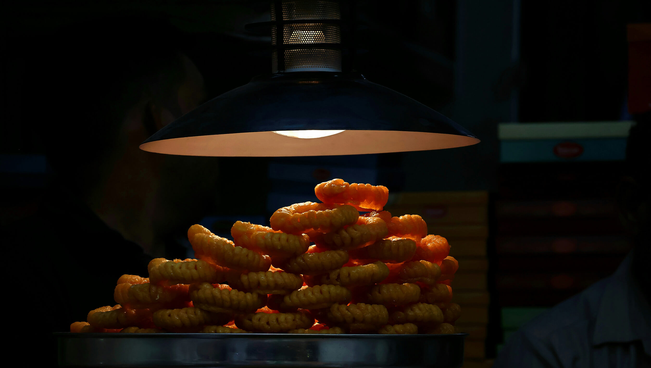
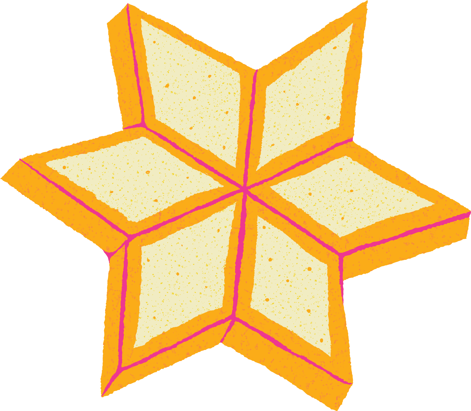
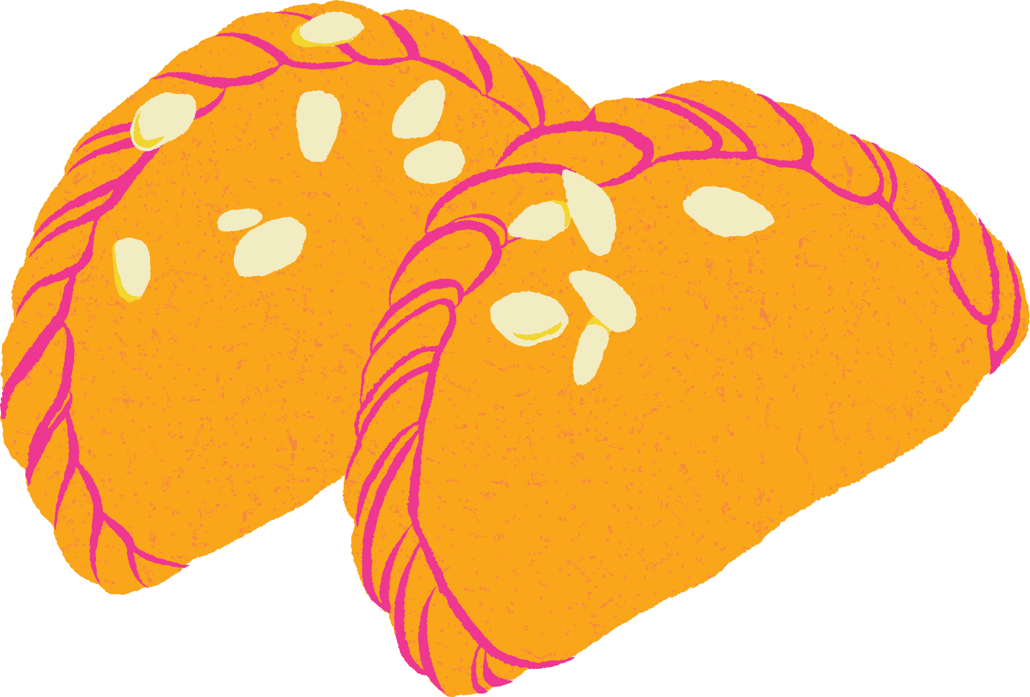
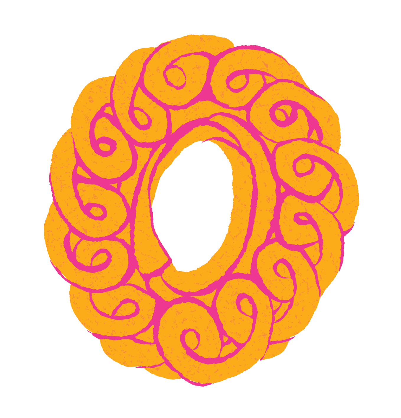
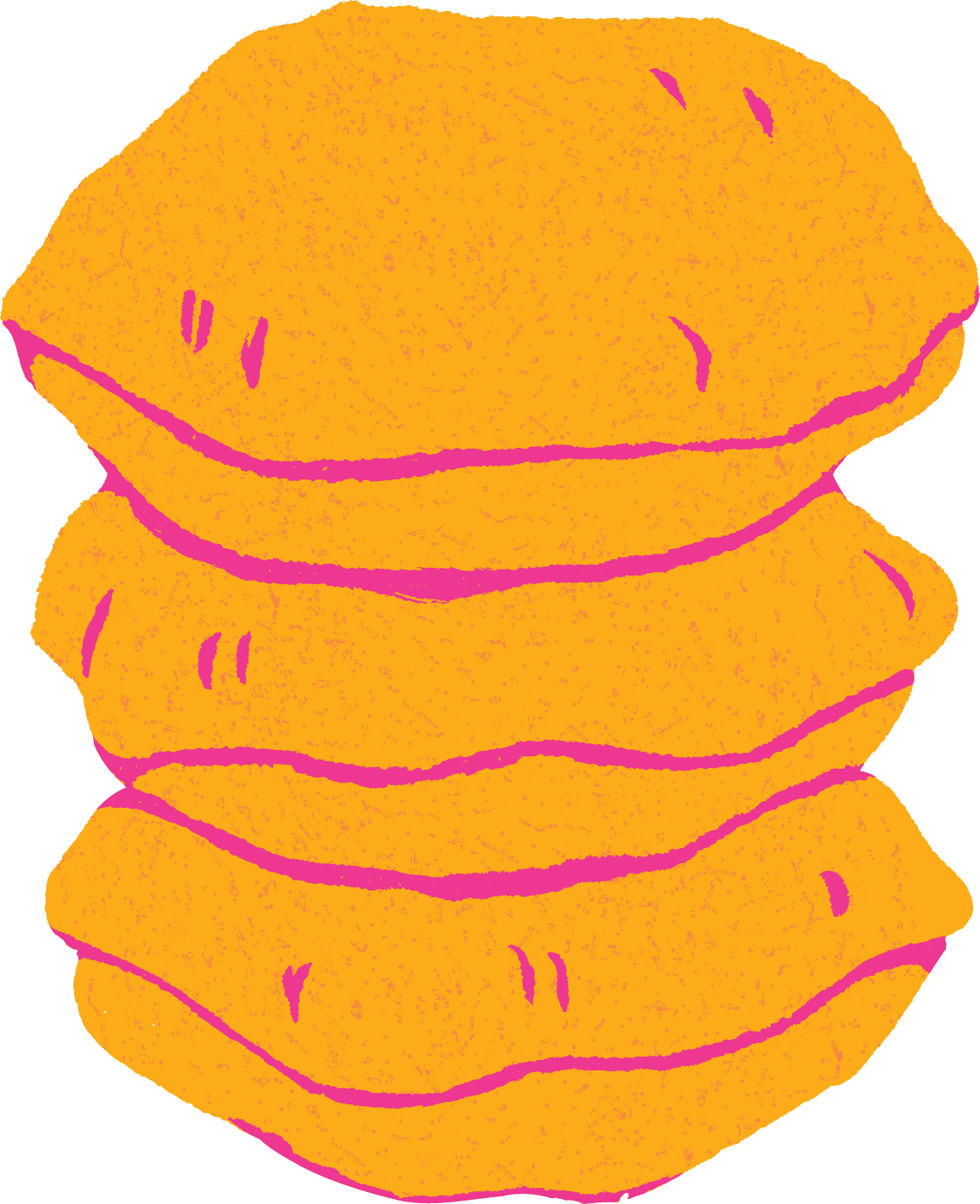
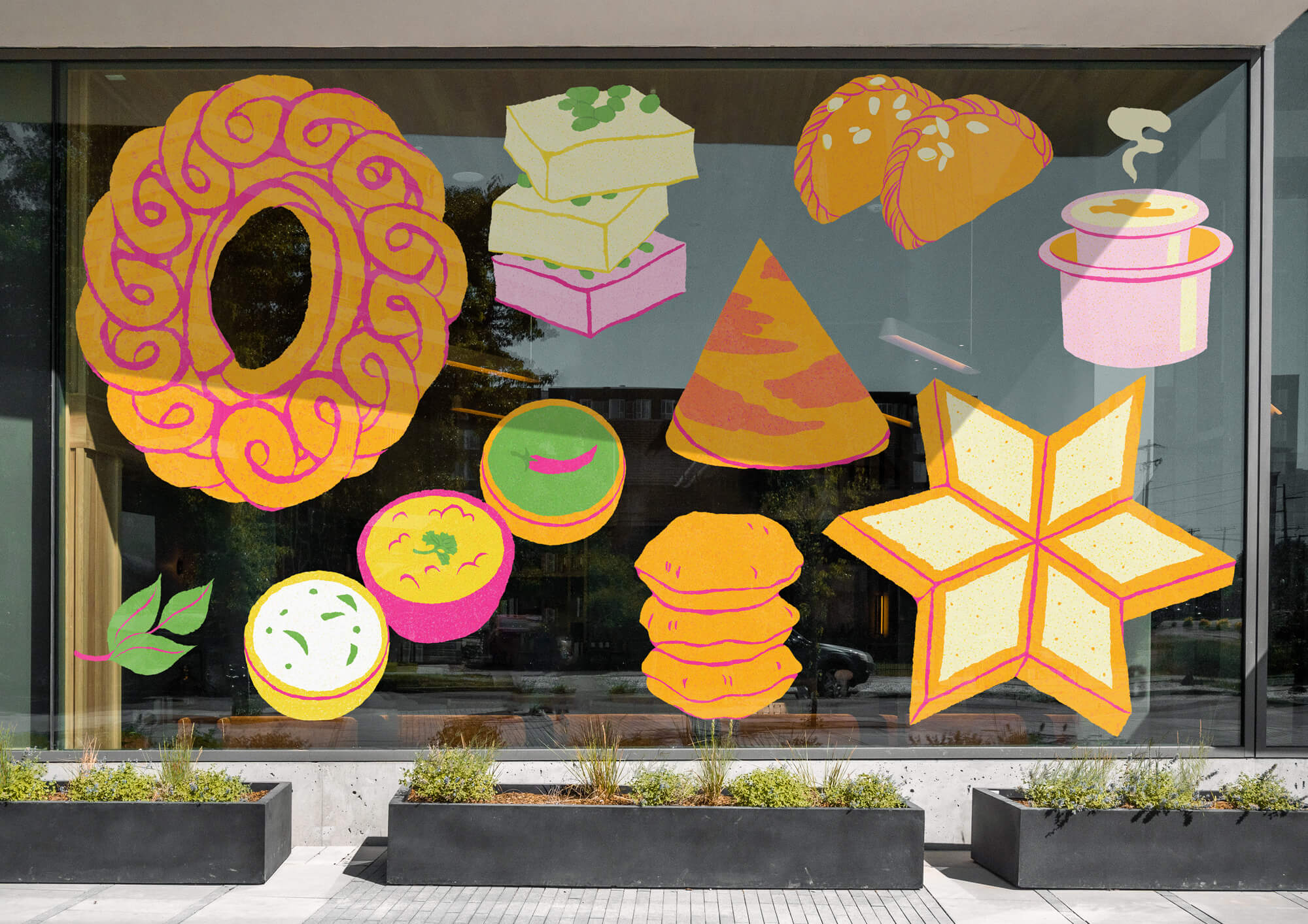
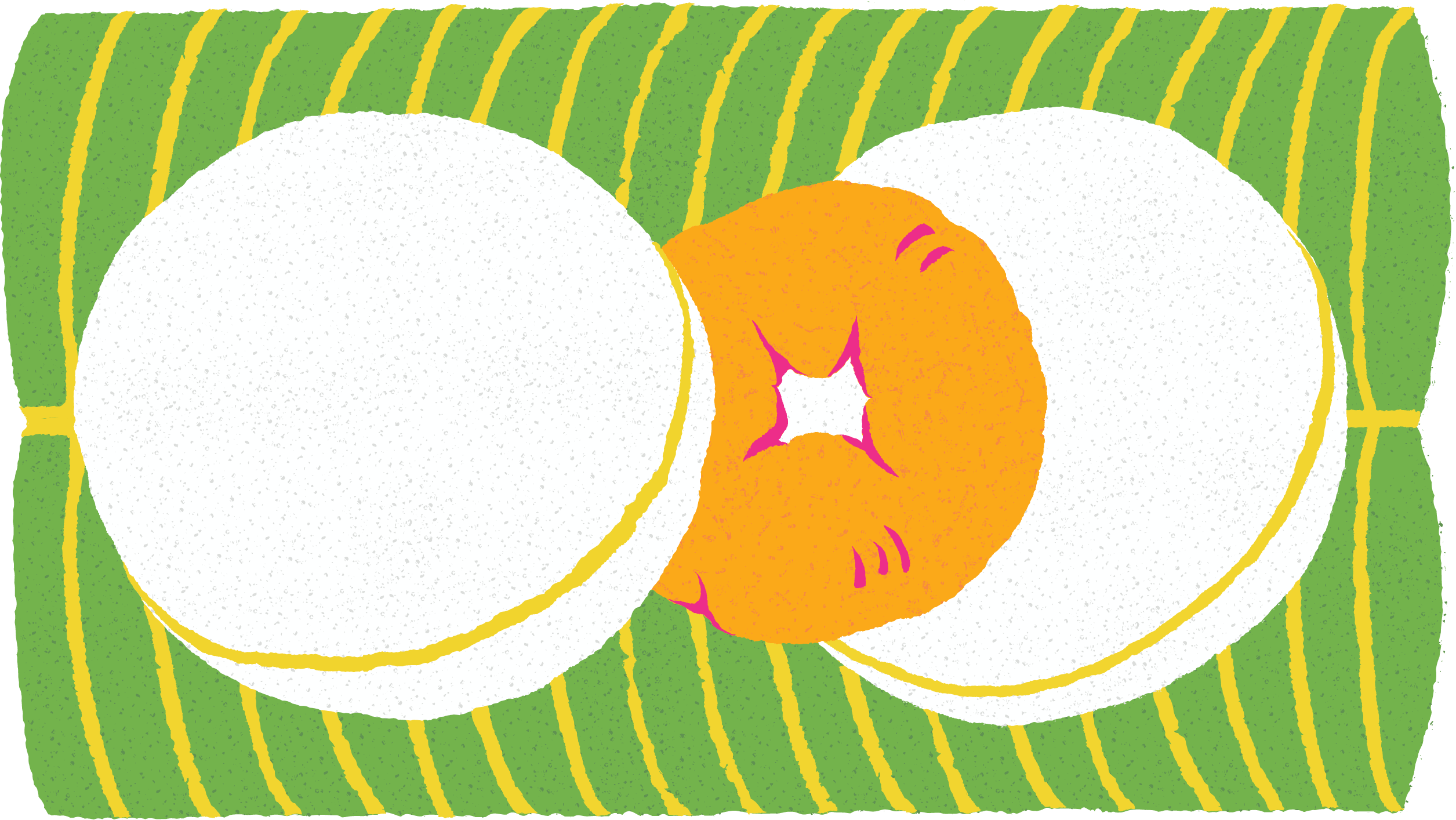
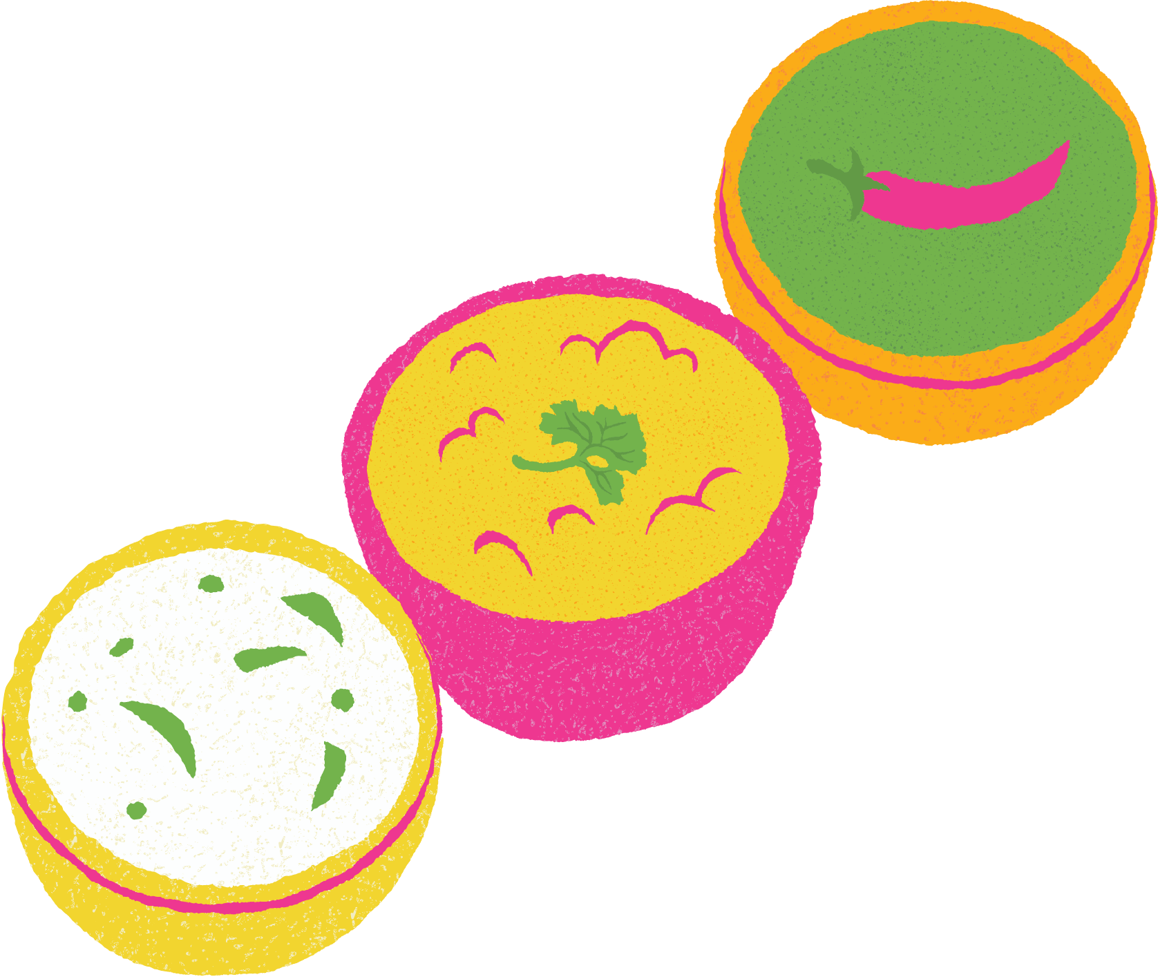
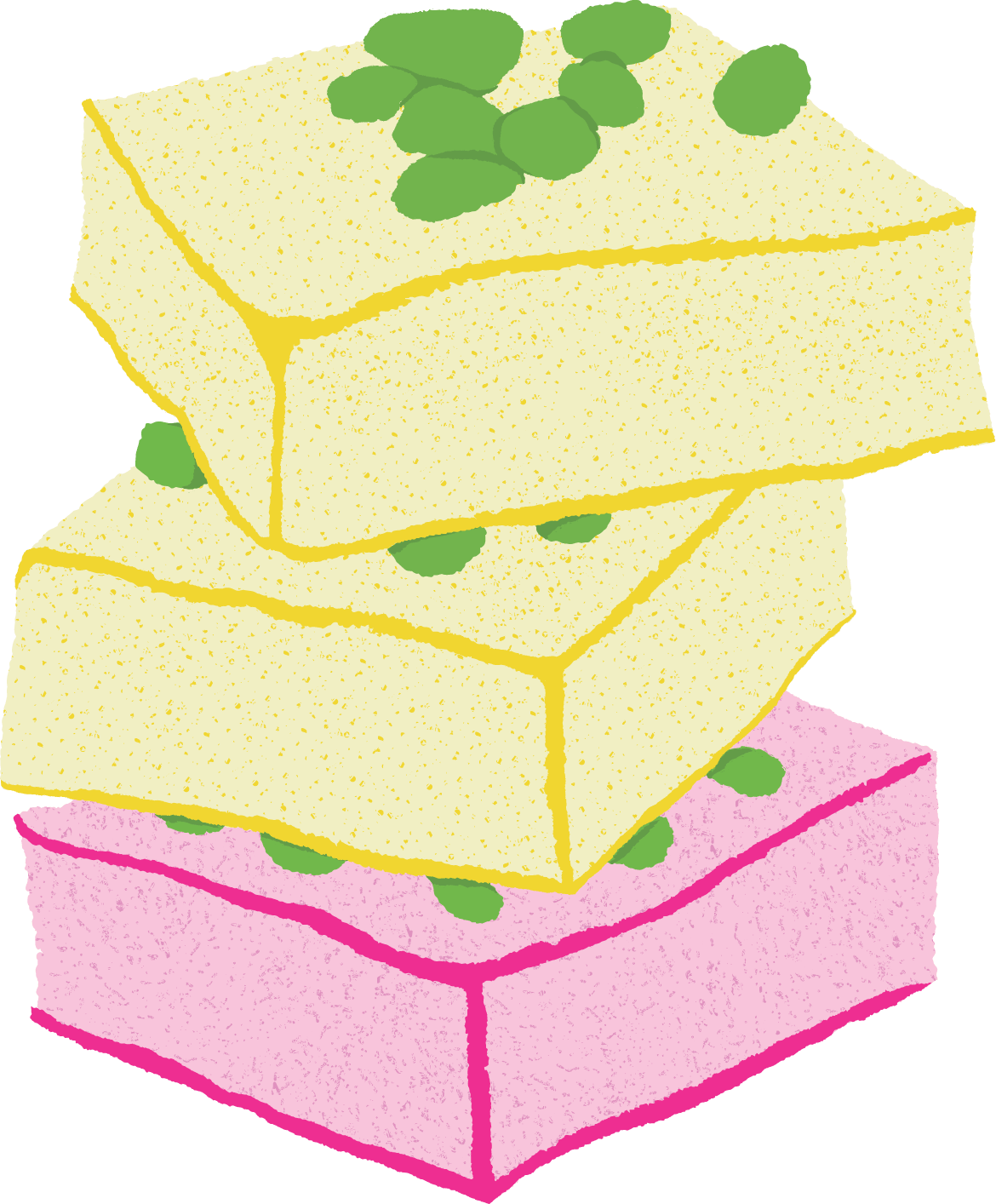
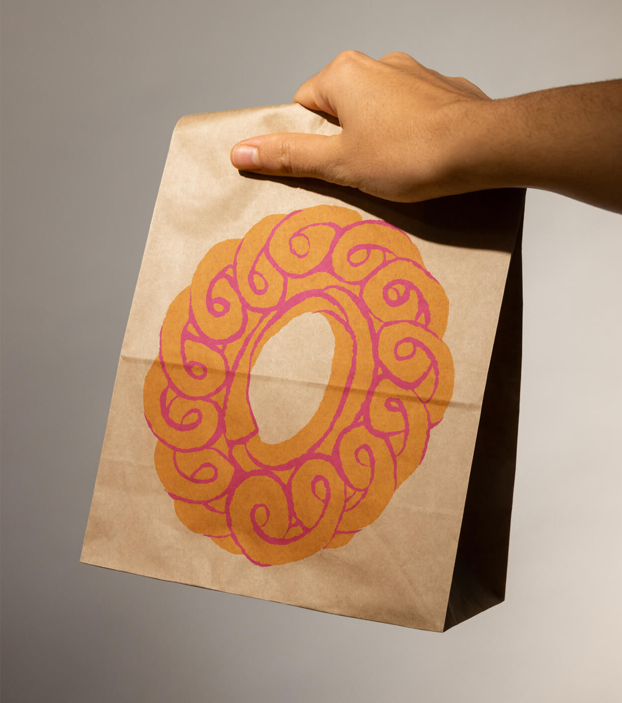
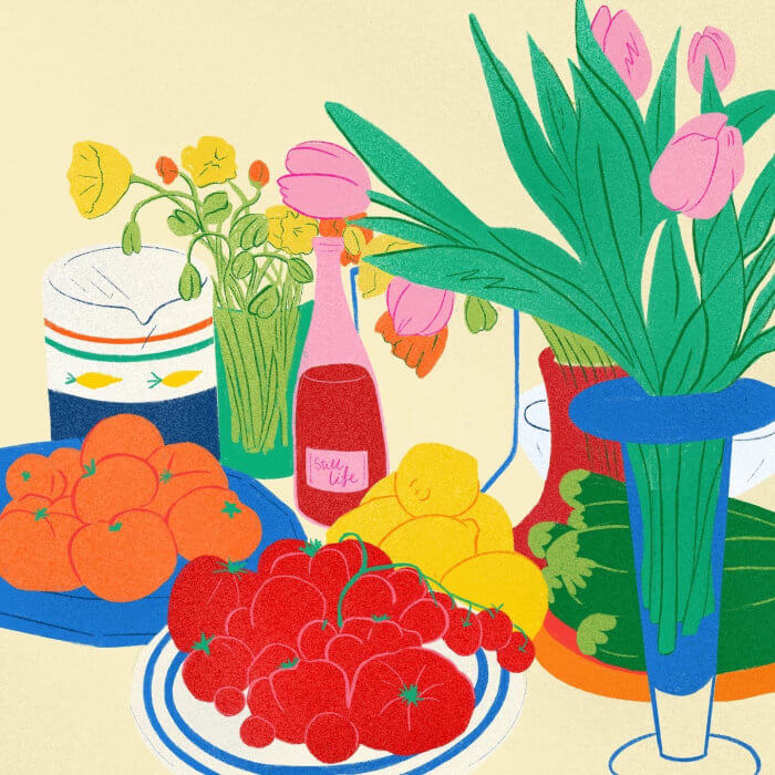
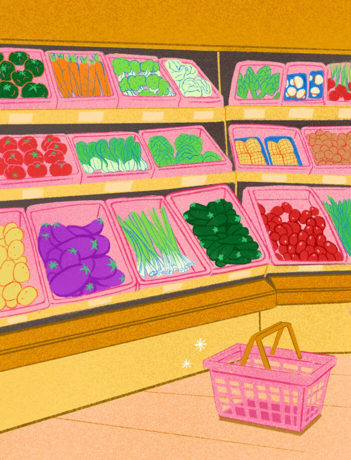
To modernise this concept, we created illustrations of key dishes from A2B’s menu with an organic, hand-drawn feel, and applied outline strokes in bright, contrasting colours.
The bold use of gold and turmeric symbolises prosperity and auspicious beginnings.


Indian woodblock printing and A2B brand colours.
Illustrator: Debs Lim


Our process began with discovery. We were inspired by Indian woodblock prints for their strong use of craft and technique. First, the rekh, derived from the word rekha, meaning outline. This block forms the fine, elaborate outline of the print, creating a detailed framework. Second, the datta, the filler block, used to stamp colours and details inside the design outlines.

To modernise this concept, we created illustrations of key dishes from A2B’s menu with an organic, hand-drawn feel, and applied outline strokes in bright, contrasting colours.
The bold use of gold and turmeric symbolises prosperity and auspicious beginnings.


Indian woodblock printing and A2B brand colours.
Illustrator: Debs Lim


We acknowledge the Traditional Owners, the Wurundjeri and Boon Wurrung people of the Kulin Nation, on whose land we wonder and work. We pay our respects to Elders past, present and emerging.

Melbourne, Australia
hello@wonderandwork.com
For project enquiries, please email Sarah Morrison
Melbourne, Australia
hello@wonderandwork.com
For project enquiries, please email Sarah Morrison

We acknowledge the Traditional Owners, the Wurundjeri and Boon Wurrung people of the Kulin Nation, on whose land we wonder and work. We pay our respects to Elders past, present and emerging.