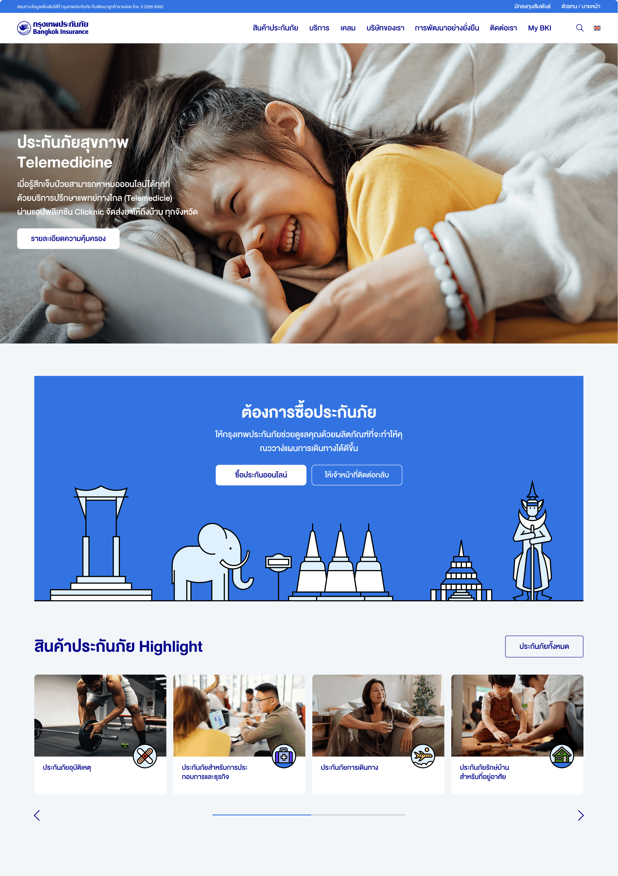
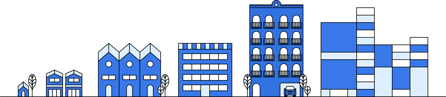

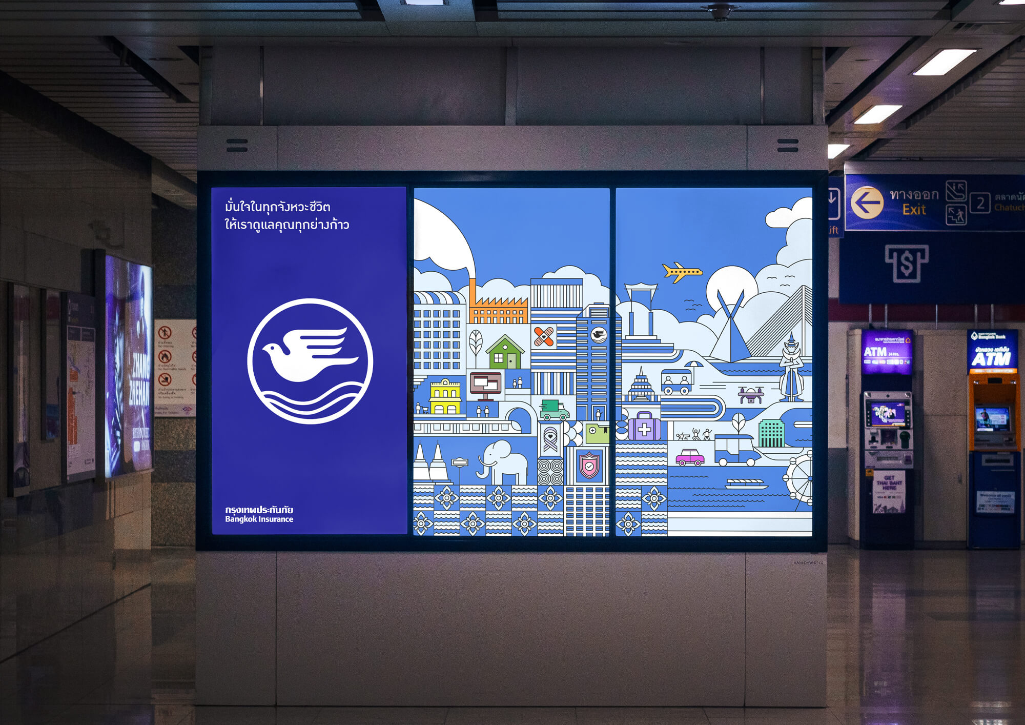
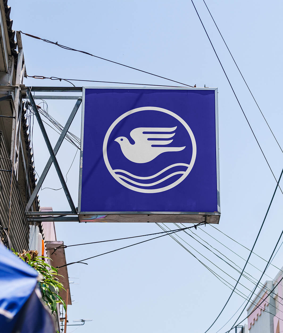
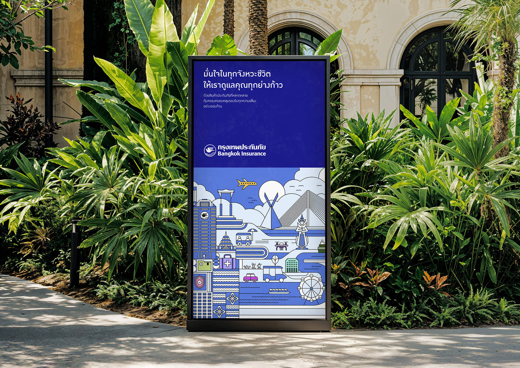
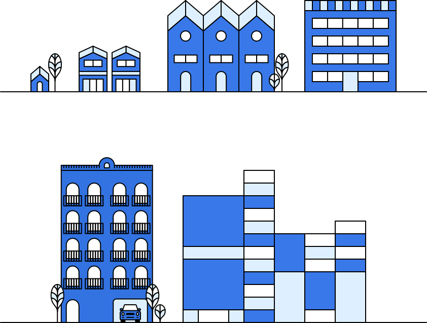


The wordmark and symbol were retained as a mark of respect, whilst the colour palette and typography were refreshed to create greater cut-through. Building the ‘World of Bangkok Insurance’ was strategically key to emphasise the breadth of coverage offered. A new visual language, leading with our hero illustration was a targeted gesture to modernise Bangkok Insurance’s appearance without disrupting their steeped history.
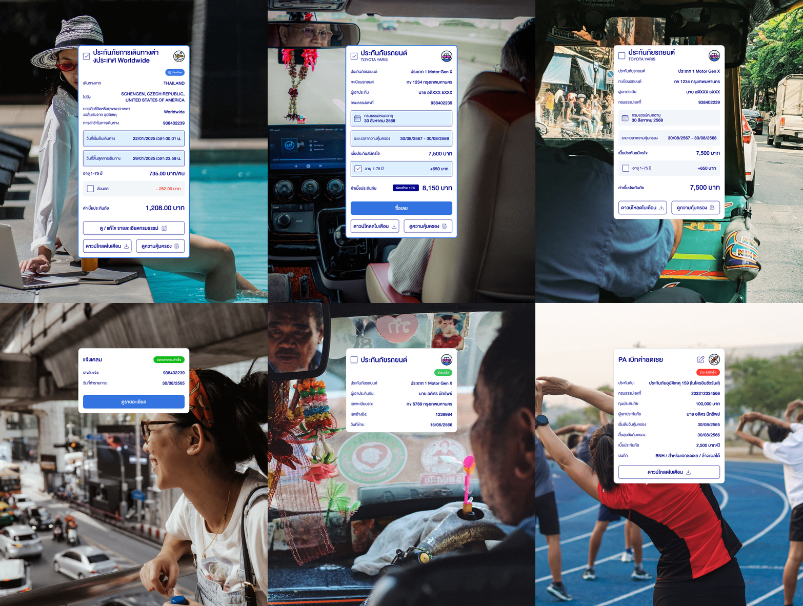
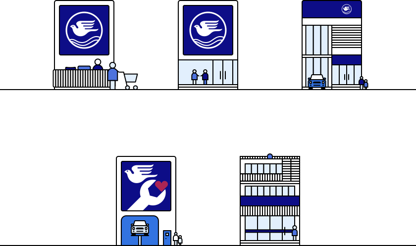
The ‘World of Bangkok Insurance’ expands to all aspects of the rebrand across product iconography and an extensive design system of templates to be used by the internal brand team. Real-world performance needs were met with a new digital platform and app design (launching 2027).


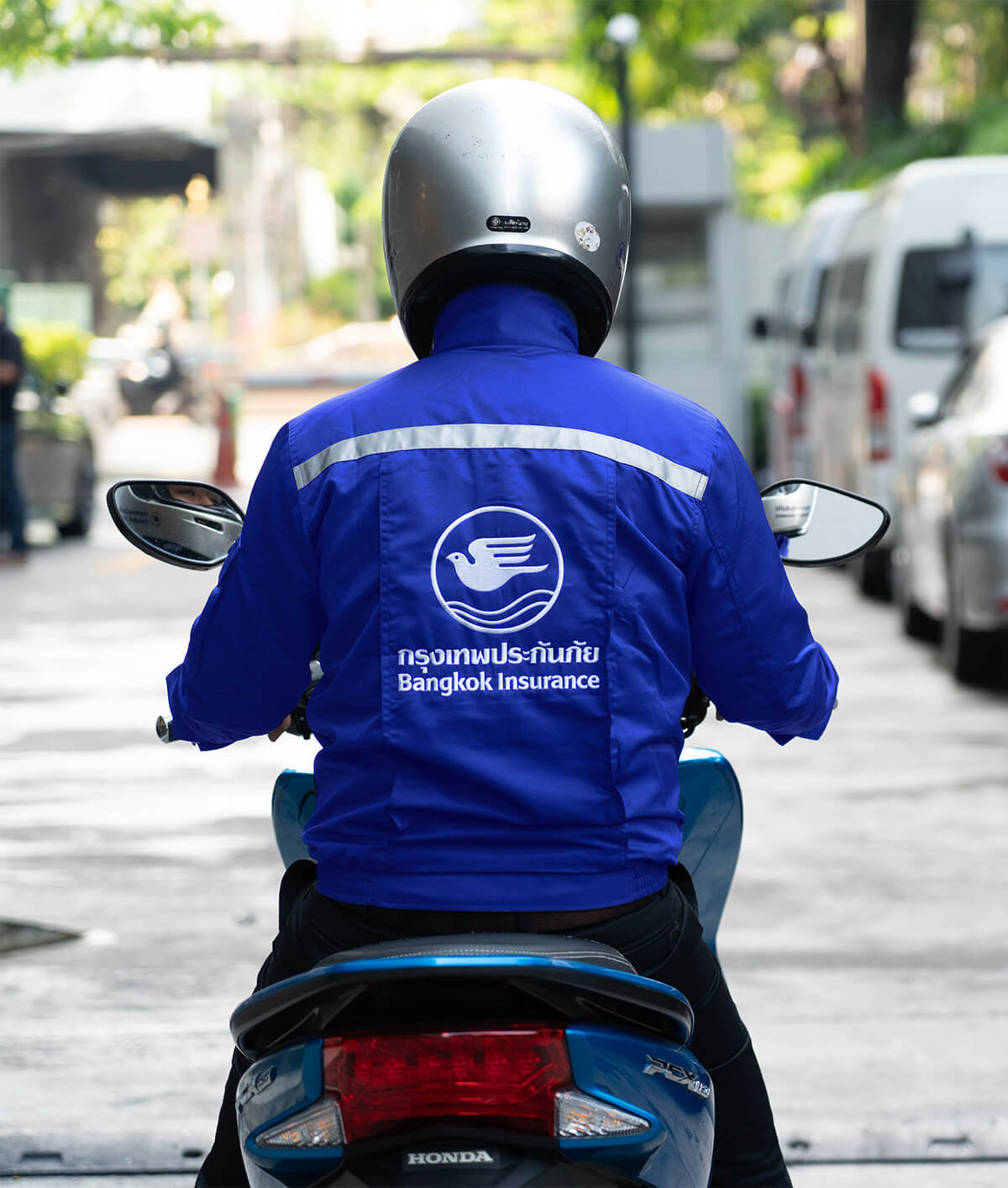
The rebrand stood out by setting a new benchmark for the insurance category in the region of South-East Asia. Specific to the market; subtle cultural nuances were created in avoidance to often felt clichés, and a human persona was built via bright, friendly colour tones. Working across multiple languages, each with their own unique rules for typography, added a complexity to be conquered.


The wordmark and symbol were retained as a mark of respect, whilst the colour palette and typography were refreshed to create greater cut-through. Building the ‘World of Bangkok Insurance’ was strategically key to emphasise the breadth of coverage offered. A new visual language, leading with our hero illustration was a targeted gesture to modernise Bangkok Insurance’s appearance without disrupting their steeped history.
The ‘World of Bangkok Insurance’ expands to all aspects of the rebrand across product iconography and an extensive design system of templates to be used by the internal brand team. Real-world performance needs were met with a new digital platform and app design (launching 2027).


The rebrand stood out by setting a new benchmark for the insurance category in the region of South-East Asia. Specific to the market; subtle cultural nuances were created in avoidance to often felt clichés, and a human persona was built via bright, friendly colour tones. Working across multiple languages, each with their own unique rules for typography, added a complexity to be conquered.


We acknowledge the Traditional Owners, the Wurundjeri and Boon Wurrung people of the Kulin Nation, on whose land we wonder and work. We pay our respects to Elders past, present and emerging.

Melbourne, Australia
hello@wonderandwork.com
For project enquiries, please email Sarah Morrison
Melbourne, Australia
hello@wonderandwork.com
For project enquiries, please email Sarah Morrison

We acknowledge the Traditional Owners, the Wurundjeri and Boon Wurrung people of the Kulin Nation, on whose land we wonder and work. We pay our respects to Elders past, present and emerging.